PROCESS
Defining goals. Learning from the experts.
Rather than waiting to learn about the project through a brief, I jumped in on early meetings with the enrollment team who had a good idea of where the gaps were in their range of tools. They also had a lot of direct experience in reaching out to guidance counselors and prospective students. So their expertise and input was invaluable in shaping goals and defining the scope of the project.
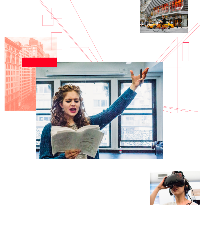
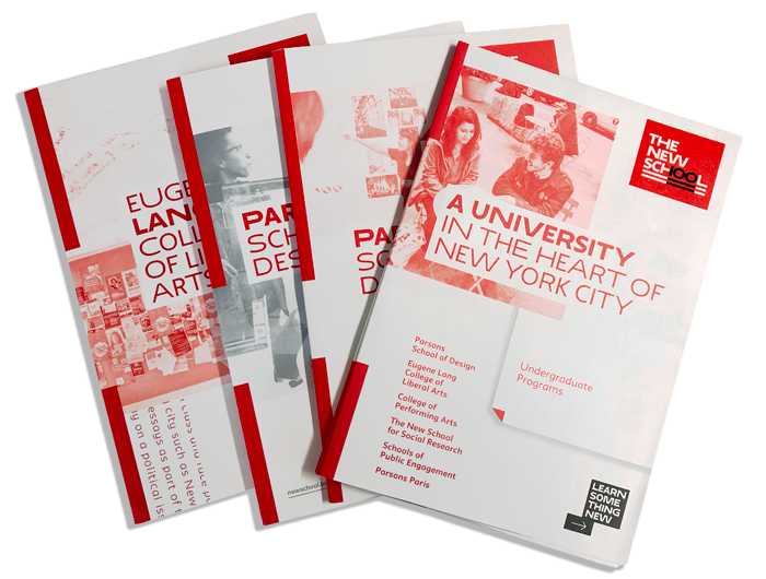
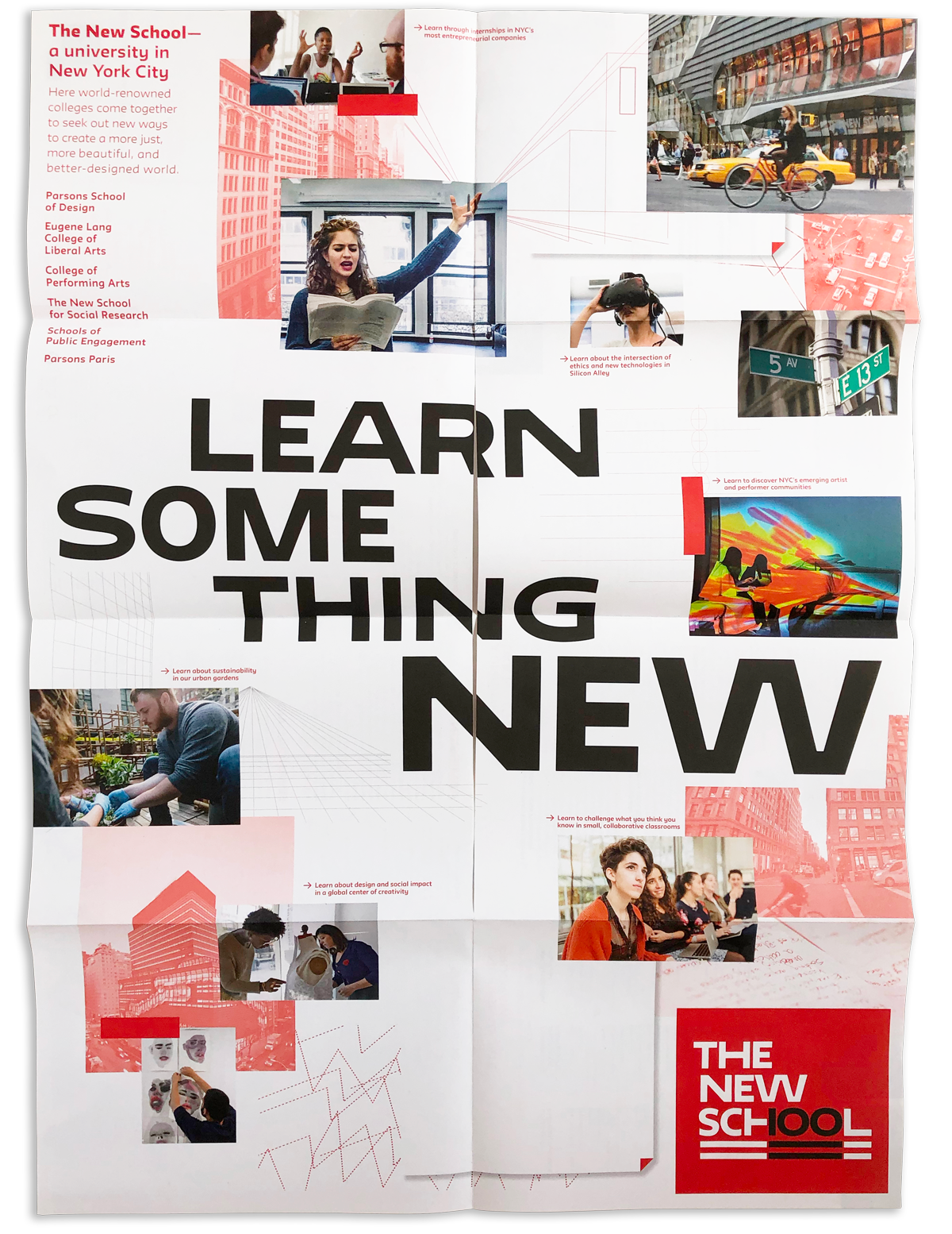
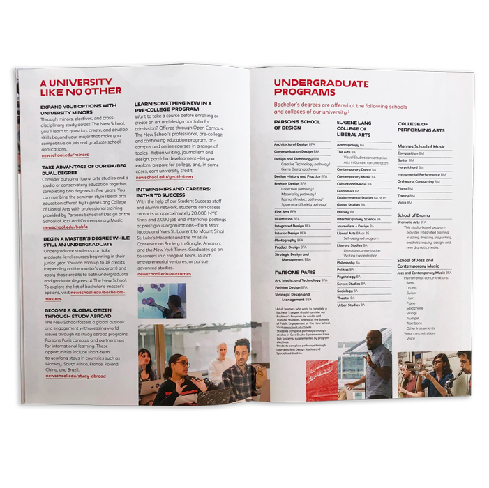
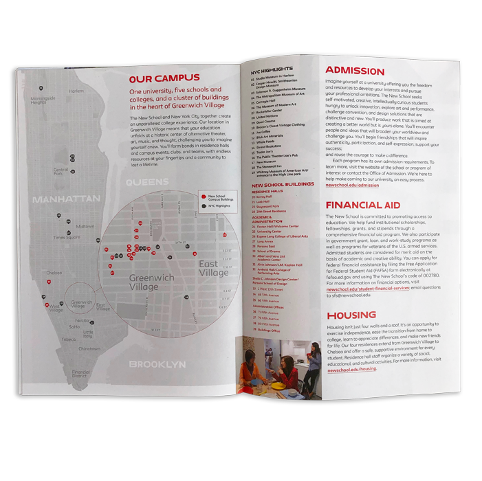
My initial understanding was that the design team was tasked with creating a poster. But it was quickly apparent that something more was needed. They wanted to be able to answer very specific and detailed questions by pointing to, or distributing, something physical to users in person. Using this understanding of needs and goals, I pulled together small collections of information from various viewbooks and created a map which placed The New School in the context of Manhattan and highlighted its campus as a collection of buildings in Greenwich Village. Together with an editor, this material was shaped into a mini viewbook. In collaboration with the creative department, I shaped the poster side into a cohesive work that highlighted, immediately and emotionally, the university's role as a participant in the creative and cultural life of the city, and as a venue to explore engaging endeavors like fashion, performance, music, scholarship, and environmental and social issues, among others.
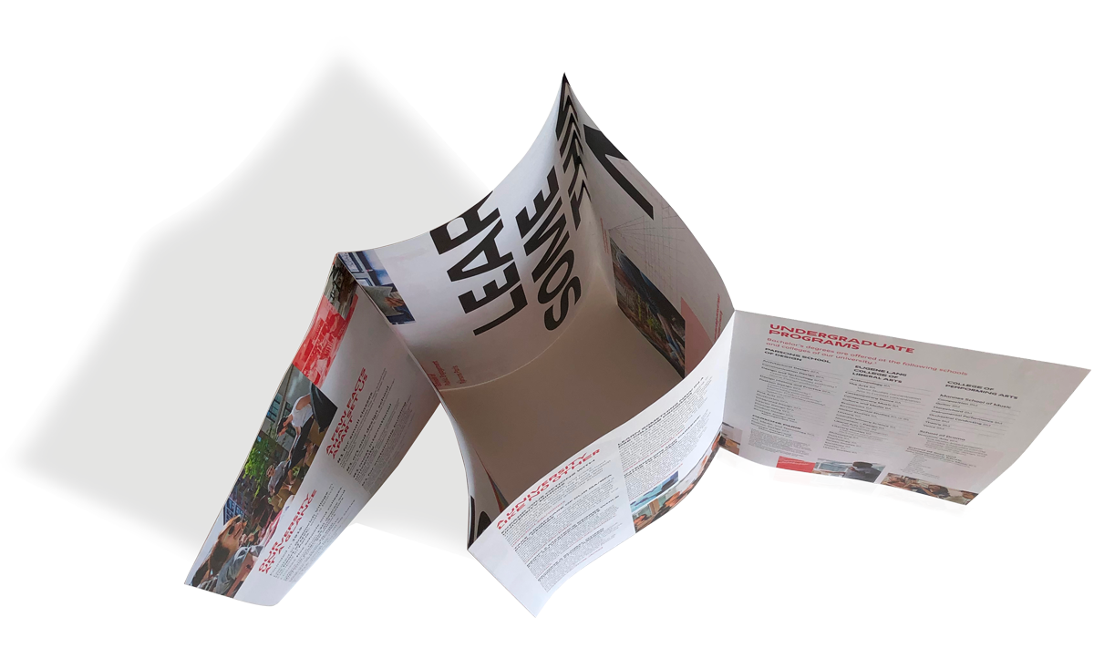
The format of the poster with a slit that allows for it to be folded into a booklet had been experimented with previously. So the enrollment team and creative department were quickly in agreement about its effectiveness as a solution in this case. Previously, I had pitched this format to clients but they often backed away due to the slit in the middle of the poster. But this allows for an extremely versitile and economical arrangement of content. Being able to utilize all of the space on the other side of the poster and having it divided nicely into discreet spreads was key.